How to Prioritize Vulnerabilities for Maximum Security Impact
Every enterprise security team receives more findings than it can close, and no amount of tooling changes that arithmetic. The question is never whether a backlog exists; it is whether the top of the backlog is the right top. Most organisations sort by severity because the report arrives sorted that way, which produces a queue that is defensible in an audit and close to useless as a risk reduction plan. Good vulnerability assessment services deliver findings that can be re-sorted, and the re-sorting is where the security value actually sits. This article sets out a four-factor model that a mid-sized team can run without new software, and the operating rhythm that keeps it working past the first quarter. Our note on building a proactive rather than reactive programme covers the wider discipline.
Key Takeaways
- Severity alone is a poor ranking key because it describes a flaw in isolation. Combine it with exposure, evidence of real-world exploitation and the business value of what sits behind the asset.
- Group findings by the process that produced them before you assign them. One process fix routinely closes twenty individual items and stops them returning in the next report.
- Report remediation as time-to-close for the top exposure band rather than as a percentage of total findings closed, which rewards clearing easy items and hides the ones that matter.
Why Severity Is the Wrong Sort Key
A severity rating describes what a flaw could do under assumed conditions. It says nothing about whether those conditions exist in your estate. The scoring vector behind the number carries environmental metrics precisely so that a receiving organisation can adjust it, yet most teams never open the vector and rank on the base score alone. The result is a queue that treats an internal test server and an internet-facing payment gateway as equivalent whenever their scores happen to match.
The distortion runs in both directions. High-severity findings on isolated systems consume remediation capacity that produces very little risk reduction, while medium-rated findings on exposed services sit untouched for months because they never reach the top of the list. Attackers do not read severity ratings; they look for what is reachable and what has a working exploit, which is a completely different filter.
There is an organisational cost too. Enterprises buying vulnerability assessment services often inherit this ordering from the report itself, and when engineering teams work a queue that does not match their intuition about risk, they lose confidence in the queue. Remediation slows, exceptions multiply and the security function spends its time defending the list rather than reducing the backlog. A ranking that engineers recognise as sensible is worked faster than one they have to be persuaded of.
The correction is not to abandon severity. It remains the best available description of technical impact and it should stay in the model. The change is to stop treating it as the whole model, and to make the other three factors explicit rather than leaving them to whoever happens to be triaging that week.
Ask your provider for the full scoring vector behind every rating as a standing deliverable. Without it you cannot re-derive a score, cannot argue with it, and cannot compare reports from two suppliers who scored the same class of issue differently.
Factor One: Exposure
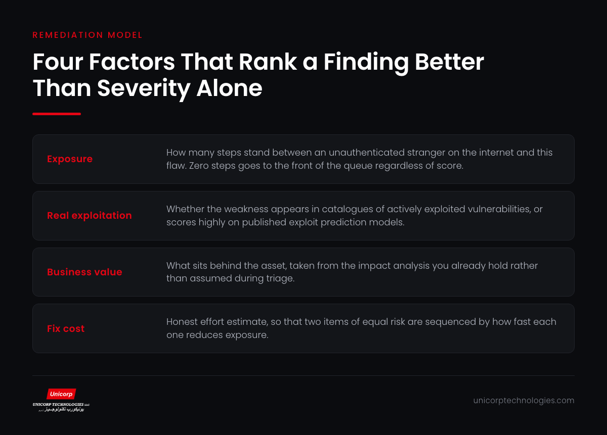
The first factor in the model is exposure, and it asks a single question: how many steps stand between an unauthenticated stranger on the internet and this flaw. Zero steps means the service answers directly from a public address. One step means an attacker needs a valid session on something else first. Three or more steps means the finding is real but the path to it is long enough that other controls will probably intervene.
This factor is worth calculating properly rather than estimating, because the answer is frequently different from what the architecture diagram implies. Assessments regularly find internal applications reachable through a misconfigured reverse proxy, or management interfaces exposed by a cloud load balancer that was created for something else. Exposure should be measured from outside, using what actually answers, not from the network design document.
Once measured, exposure gives you a clean top band. Anything at zero steps goes to the front of the queue regardless of severity, because it is the only category where an attacker needs no preconditions at all. Enterprises that adopt this single rule usually find their genuine emergency list shrinks to a handful of items, which makes it possible to fix them quickly.
Exposure also changes over time without anyone touching the vulnerable component. A firewall change, a new public endpoint or a cloud service moved to a different subnet can all promote a finding from step three to step zero overnight. That is why the exposure calculation needs its own monthly refresh, separate from the assessment cadence.
For operational technology and industrial estates the same logic applies with tighter constraints, since patching windows are rare and segmentation carries most of the load. Our note on securing operational environments with a zero trust approach covers how exposure is managed where the fix cannot be a patch.
Factor Two: Evidence of Real Exploitation
The second factor asks whether anyone is actually using this weakness in the wild. A tiny fraction of published vulnerabilities are ever exploited at scale, and knowing which fraction is the highest-leverage input available to a remediation team. Two public sources make this practical without any additional licensing.
The first is the catalogue of vulnerabilities confirmed to be actively exploited, which is a binary signal and should be treated as one. If a finding appears there, it moves to the emergency band immediately. The second is the exploit prediction scoring system, which estimates the probability that a given vulnerability will be exploited in the next thirty days and gives a continuous score you can threshold.
Combining the two with exposure produces a remarkably short list. In most enterprise estates, findings that are both internet-reachable and known to be exploited number in the low tens, not the hundreds. That list is actionable in a single change window, and closing it removes the overwhelming majority of realistic intrusion paths.
The counterintuitive consequence is that a large share of high-severity findings will fall below medium-severity ones in the final ordering. That is correct, and it needs to be explained to auditors and to the board before it appears in a report, so that a deliberate ranking decision is not mistaken for a lapse.
Factors Three and Four: Business Value and Fix Cost
The third factor that vulnerability assessment services should help you quantify is what sits behind the asset. A flaw on a system holding customer financial records is not equivalent to the same flaw on an internal wiki, and the difference should be encoded rather than assumed. Most enterprises already hold this information in a business impact analysis or an asset criticality register; the work is joining it to the findings register, which is usually a matter of a shared asset identifier.
The fourth factor is fix cost, and it is the one security teams are most reluctant to include. Two findings of identical risk where one takes an hour and the other takes a quarter are not equivalent work items. Sequencing the cheap one first is not a compromise; it is how you reduce total exposure fastest. Ignoring effort produces plans that look rigorous and never finish.
Fix cost also exposes the findings that need an architectural decision rather than a ticket. When the honest estimate for closing an item is six months, the right response is usually a compensating control now and a roadmap item for the structural fix, not a ticket that ages in the queue while everyone pretends it is being worked.
Together the four factors give you bands rather than a strict ordering, which is what teams can actually work with. An emergency band that must close inside days, a priority band worked in the current sprint cycle, a scheduled band assigned to the quarter, and an accepted band with a documented owner and review date.
Strong vulnerability assessment services will support this model by delivering findings with the asset identifier, the full scoring vector and the tester's own view of effort. If your current reports arrive as a severity-sorted list with none of that metadata, that is a supplier conversation worth having before it becomes a tooling project.
Grouping by Root Process Before Assigning
Before anything is assigned, run one more pass over the list and group findings by the process that produced them. Twelve instances of an expired certificate are one process failure in certificate lifecycle management. Nine instances of over-permissive storage are one failure in the provisioning template. Assigning the twelve individually produces twelve tickets and no durable improvement.
This grouping exercise is the single highest-return activity in the entire remediation cycle and it takes an afternoon. It converts a long list of symptoms into a short list of causes, and the short list is what you take to the teams who own those processes. It also makes the following quarter's report predictable, because you know which categories should have disappeared.
The grouping is where DAST results and infrastructure findings usually converge. An authorisation gap found in a running application and an over-broad role found in the cloud estate frequently trace back to the same absent standard, and fixing the standard closes both. Reports that keep application and infrastructure findings in separate documents hide these joins, which is a good reason to consolidate them.
Where a process cannot be changed quickly, record that explicitly and set a compensating control with a review date. An honest accepted-risk entry with a named owner is worth more than an open ticket nobody is working, and it survives an audit far better than a backlog with no movement.
Our note on how hidden weaknesses surface during testing shows why so many findings share a small number of root causes once you look past the individual instances.
Reporting That Keeps the Model Alive
Most remediation programmes decay at the reporting layer rather than the technical one, long after the vulnerability assessment services that produced the findings have finished. Percentage-of-findings-closed is the usual metric and it rewards exactly the wrong behaviour, because clearing fifty trivial items moves the number further than closing one exposed and actively exploited flaw. Within two quarters the metric is green and the risk is unchanged.
Replace it with two measures. First, time-to-close for the emergency band, reported as a distribution rather than an average so that the long tail is visible. Second, the count of open items in the emergency and priority bands, which should trend toward zero and stay there. Both are hard to game and both describe something a board can act on.
Add a third measure once the programme is stable: recurrence rate by finding category. If the same category reappears after being closed, the process fix did not hold, and that is a more useful signal than any absolute count. It also tells you where to spend the next round of engineering effort.
Review the bands monthly rather than after each assessment. Exposure changes with every network and cloud change, exploitation evidence changes weekly, and a queue refreshed only when a report arrives will be stale for most of its life. The monthly review is short if the model is set up correctly, usually under an hour.
If you want a second view on how your current findings are ranked and where the recurring categories sit, our team can review your latest report with you. You can also see how our wider security practice is structured and where assessment and remediation support fit within it.
Frequently Asked Questions
Why is severity a poor way to rank findings?

How do we measure exposure accurately?
Which public sources tell us what is really being exploited?
Should fix effort influence the order of work?
What does grouping by root process mean?
How often should the prioritisation be refreshed?
What should we report to the board?
What if a finding cannot be fixed at all?
Do application and infrastructure findings need separate queues?